The release of Google’s mobile-friendly update and the continuous rise in mobile device usage have led to increasing in the popularity of Responsive Web Design (a.ka. RWD). In fact, building a responsive website is becoming a hard-to-ignore need among website owners.
Perhaps, you may choose to install a pre-made responsive WordPress theme for setting up your website. No doubt, this is one of the easiest and quickest ways to create a responsive site.
But, keep in mind that a ready-made theme often contains plenty of bugs. Also, there is a greater possibility that the theme you’ve installed is not truly responsive.
To deal with such issues, it is better to create your own custom theme using media queries. In this tutorial, we’ll be talking about the process of using media queries in a responsive design. But, let us first have a brief introduction to media queries.
An Overview of Media Queries
Media queries are, basically, a CSS3 module that adapts the content according to a screen resolution. Most importantly, it helps create unique styles for a specific device screen. For example, the below line of code will help in loading the “new-style.css” stylesheet for a particular device screen:
<link href="my-style.css" type="text/css" media="screen" rel="stylesheet"/>
You can even choose to add distinct styles for mobile devices using the “device-width” parameter, as shown in the code below:
<link href="mobile-style.css" type="text/css" media="screen and (max-device-width: 640px)" rel="stylesheet"/>
Executing this line of code will load the “mobile-style.css” stylesheet when your device max-width is set to 640 px.
But, before moving further, you need to be familiar with “device-width” and “width”.
Understanding what is “device-width” and ‘width”
The “device-width” media feature determines the width of the screen of a device. While the “width” media feature determines the fixed width of the rendering area of the output device.
When the value of width is set to device-width, your web design will automatically adapt itself according to the device screen. In contrary, assigning a fixed value to the width will make your design adjust to the width of the rendering surface of a device.
Most of the experienced developers prefer using “device-width” media feature since it makes the design automatically scale to fit a device screen. No doubt, this is one of the simplest ways to create responsive layouts. But, using device-width as the value of width requires styling devices individually. This can be challenging, as styling your CSS based on each device becomes overwhelming and you may end up writing poor code.
Albeit, you may find using width-based media queries somewhat difficult in the beginning, but it helps in making a web design truly responsive, as it behaves according to your need across all device screens.
How You Should Use Media Queries in a Responsive WP Site?
In order to make your WordPress design responsive using media queries, be sure that the “viewport” meta tag is included in your web page’s <head> element, as follows:
<meta name="viewport" content="width=device-width,initial-scale=1">
This line of code will make your web page accessible on all the device screens.
Note: When using media queries for creating a responsive design, be sure to include meta tag in the right place, or all your efforts will go in vain. This is because the media queries will not refer to the layout viewport of the device in the correct manner.
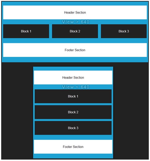
Below is an example that illustrates how your web page will appear on an iPhone 4 screen using the “width” media query:
body{
	margin: 20px 0;
	background: #1ea2d3;
}
header{
	width: 98%;
	float: left;
	padding: 25px 0;
	text-align: center;
	background: #FFF;
	color: #222;
	margin: 0 1% 20px 1%;
}
footer{
	width: 98%;
	float: left;
	padding: 25px 0;
	text-align: center;
	background: #FFF;
	color: #222;
	margin: 20px 1% 0 1%;
}

ul{ /* Desktop */
	margin: 0 auto;
	padding: 0;
	list-style: none;
}
li{
	width: 31.33%;
	float: left;
	margin: 5px 1%;
	padding: 20px 0;
	text-align: center;
	background: #222;
	color: #FFF;
}

@media only screen and (max-width: 640px) { /* Mobile */
	li{
		width: 96%;
		margin: 5px 2%;
	}
}
Output:

Conclusion
Remember that you cannot be sure about: which device is used to access your website (i.e. a mobile device or a computer system). However, considering the fact that the majority of users’ prefer to browse the web using mobile devices, it becomes important that your desktop website also work well, even when it is being viewed on a mobile or tablet device screen. You can accomplish such an objective, by turning your website design into a responsive one.
One of the most recommended ways to turn a website layout into a responsive design is to make use of media queries. Going through this tutorial will help you understand the proper way to use media queries in a responsive design.

