Retro stuff is highly popular in various spheres of life today. Extreme popularity it has gained in web design, where it turns out to be a trend of the latest years. Vintage designs don’t call any associations with something outdated, but look undoubtedly effective. Retro elements bring original tone into modern designs, making the latter even more interesting to browse. Retro style in web design doesn’t mean a vintage look of the whole layout. It can be even only one element that turns design into a stylish vintage one. What can make your site retro?
- Typography
- Images
- Color palette
- Textures
- Patterns
- Badges
- Icons
- Old music playing in the background
The variety of fields that make use of retro style in design is really immense. It can be sites of business companies, personal pages, creative design agencies, architecture bureaus, music stores, fashion shops and a great number of others. Nostalgic notes in their designs catch attention and drive more visitors and interested people in.
Showcase of sites with aged textures, muted colors and impactful typography is a good source of inspiration for all of those who are looking for trendy ideas in website design. Go on reading this post and enjoy browsing the most effective examples of Retro Style in Web Design. If you know any other examples you want to share with the rest of our readers, feel free to do it in the comment section. Your ideas are appreciated.
Gaumont T.S. Spivet
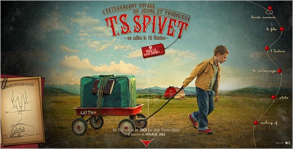
Large photo backgrounds in retro style and vintage typography give this site the first place in this compilation of retro designs. You can scroll down to enjoy its retro look or use dotted line with pins indicating menu items (scalable vector graphics that is driven by JS) in the right sidebar.
Rock Hound
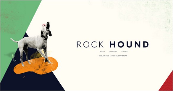
Diagonal designs like this one were extremely popular in 2011. It turns out to be a kind of retro element of this site. Retro-styled background that moves at different speeds with the foreground (parallax effect) make this site hard to miss.
Radio NY Moon
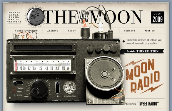
Large image of the old radio in the top makes this design look retro and skeuomorphic (it imitates the life object). Old paper texture on the background and large retro fonts intensify visual effectiveness of this site.
Parker Iain Design
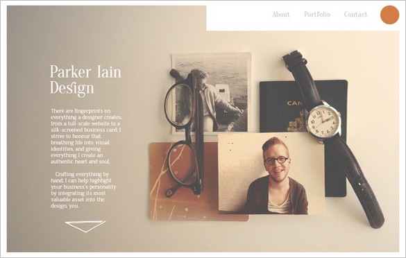
Nice photo in faded colors (like the one shot with old camera) in the top block of this site sets retro tone of this web page and speaks for the perfect taste of its owner. Choosing such content centric stylish designs, you can successfully promote your works online.
Miss Mary’s Morning Elixir

Pin-up is always on the wave. Using the images of such lovely girls is one of the best ways to make your site look retro and highly appealing. The site you see features a beautiful Missy on its front page to engage more visitors. Parallax scrolling makes their work with this site even more pleasant.
Solasie
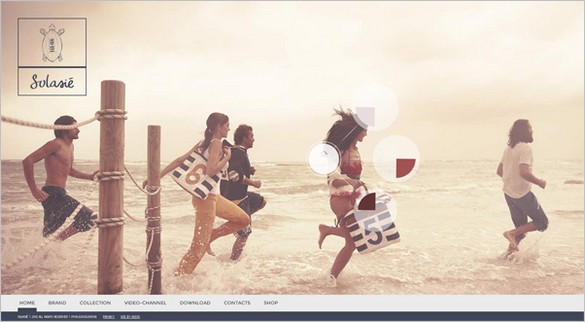
The next site is a huge gallery with large retro photos on the background (you can see their previews in the top). Fly-out blocks offer additional options, so you can download the latest catalogues, for example, or watch featured videos.
The Vintage Catering Company
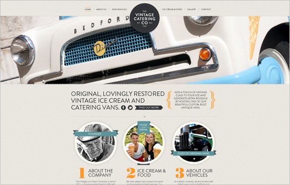
Here is an example of harmonious combination of retro and modern styles. Circular design elements, large typography and full-width slider are popular trends of 2013, and they behave quite well with retro badge with the name of the company and vintage background texture.
Name of Change
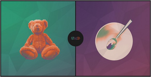
Go on and check out this highly interactive website. 3 variants of background: purple, coral, green (all done in retro style) indicate three main categories of the site.
Adjust Digital Conversations
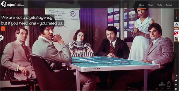
Here you see single page layout with the content subdivided into 4 parts that slide when you click menu items. Additional menu in the right sidebar allows to see pop-up with information.
Two Fish Illustration

Vinyl image on the background with some information written above it makes this design look retro. Minimal style, cool gallery and parallax scrolling add effectiveness to this site.
As you see, retro style in web design can easily make a site stand out of the crowd and become interesting to the viewers. Being frequently used with other popular design trends, it enhances the effectiveness of the site.

